
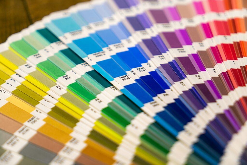
Most organisations have a brand colour that matters to them: a particular red, a corporate blue, a green that appears on every sign. Then the first banner arrives and the colour is not quite the one on the website. This is rarely a printing mistake. Colour depends on the device, the material, the inks and the light it is seen in. Understanding those factors lets you get much closer, and keep colour consistent across different jobs.
Why screen and print differ
A screen makes colour by emitting red, green and blue light (RGB). It can show very bright, saturated colours, and every screen is set up slightly differently. Print makes colour by laying cyan, magenta, yellow and black inks (CMYK) on a surface that reflects light. The range of colours inks can produce, called the gamut, is smaller than a screen’s. Vivid oranges, electric blues and bright greens are the usual casualties: there is simply no CMYK mix that matches what the screen shows.
So the first step is to stop judging print colour from a screen, especially one that is not calibrated.
Pantone, CMYK, RGB and hex
Many brand guidelines list several versions of the same colour:
- Pantone (PMS): a reference to a specific ink colour in the Pantone system, defined by a physical swatch. This is the best single reference to give a printer.
- CMYK: the ink mix intended to approximate the brand colour in four-colour print.
- RGB and hex: values for screens and websites. Useful for digital, not for print.
Large format digital printers print in CMYK-based inksets, not with mixed Pantone inks, so a Pantone colour is reproduced as closely as the inks and material allow. Most Pantone colours can be matched very closely; a few cannot be matched exactly. If your guidelines give a Pantone reference, include it with your artwork.
The material changes the colour
The same file printed on different materials will not look identical. Gloss paper makes colours look deeper and more saturated; matt paper and fabric look softer; mesh lets background show through its holes; canvas has texture; backlit film looks quite different lit from behind than in daylight. If one campaign uses several materials, expect small differences between them and judge each against the reference swatch rather than against each other.
Light changes the colour too
Colours look different under daylight, warm spotlights, fluorescent tubes and LED. An exhibition hall, a shop interior and an outdoor site are all different. Where it matters, look at your proof in light similar to where the print will be shown.
Practical steps for consistent colour
- Send your references. Pantone numbers, your CMYK values, and ideally a printed sample that you are happy with.
- Build print artwork in CMYK. You will see a more realistic preview, and avoid an unexpected shift at conversion.
- Keep colour values consistent across files. The same blue should have exactly the same values in every document.
- Ask for a test print or proof for critical colour. A small print on the actual material is the only reliable check.
- Reorder from the same files and material. We keep your files, so reprints and updates start from what was approved before.
- Be realistic about bright colours. If a neon or very bright brand colour sits outside the ink gamut, consider a closely matched coloured vinyl or a spot colour for that element.
When a solid colour must be exact
For solid areas of a brand colour, such as lettering, logos or a coloured panel, cut vinyl is an alternative to printing. Our cut vinyl lettering comes in 3M vinyl and Pantone colours, and coloured vinyl can be applied to a board where a special colour is needed. Because the colour is in the film rather than made from inks, it is consistent from piece to piece. See window, wall and floor graphics and window vinyl options.
Matching across a campaign
If you are producing banners, stands, posters and signs at the same time, printing them together helps them match. Tell us which items will be seen side by side, such as a pop-up display next to roller banners, and we will keep an eye on those colours in particular.
When you send your artwork, include your brand references and a note of which colours matter most. If your files need preparing, our designers can set them up for print.
Getting started
To discuss a colour-critical job, request a quote and mention the colours that matter most and the materials involved. We will tell you whether a test print is worth doing.
Questions
Can you match a Pantone colour exactly?
Most Pantone colours can be matched very closely in large format digital print, but a few, especially very bright ones, cannot be matched exactly with CMYK-based inks. For solid colour, cut vinyl in Pantone colours is an alternative.
Why does my banner not match my website?
Screens use RGB light and can show brighter colours than inks can print. Judge print colour against a printed reference or Pantone swatch, not a screen.
Can I see a proof before the full run?
Ask for a test print when colour is critical. A small print on the actual material is the most reliable way to check.
Will a reprint match the original?
We keep your files so reprints start from the same artwork. Tell us it is a reprint and, if possible, which material was used before.
Request a quote · Send artwork · 0203 026 0636